Disable macOS Big Pointer Arrow When You Shake
On a Mac when you shake the pointer arrow to locate it, it gets bigger. This does make the pointer easier to find, but if you find it distracting here’s how to disable it.
On a Mac when you shake the pointer arrow to locate it, it gets bigger. This does make the pointer easier to find, but if you find it distracting here’s how to disable it.
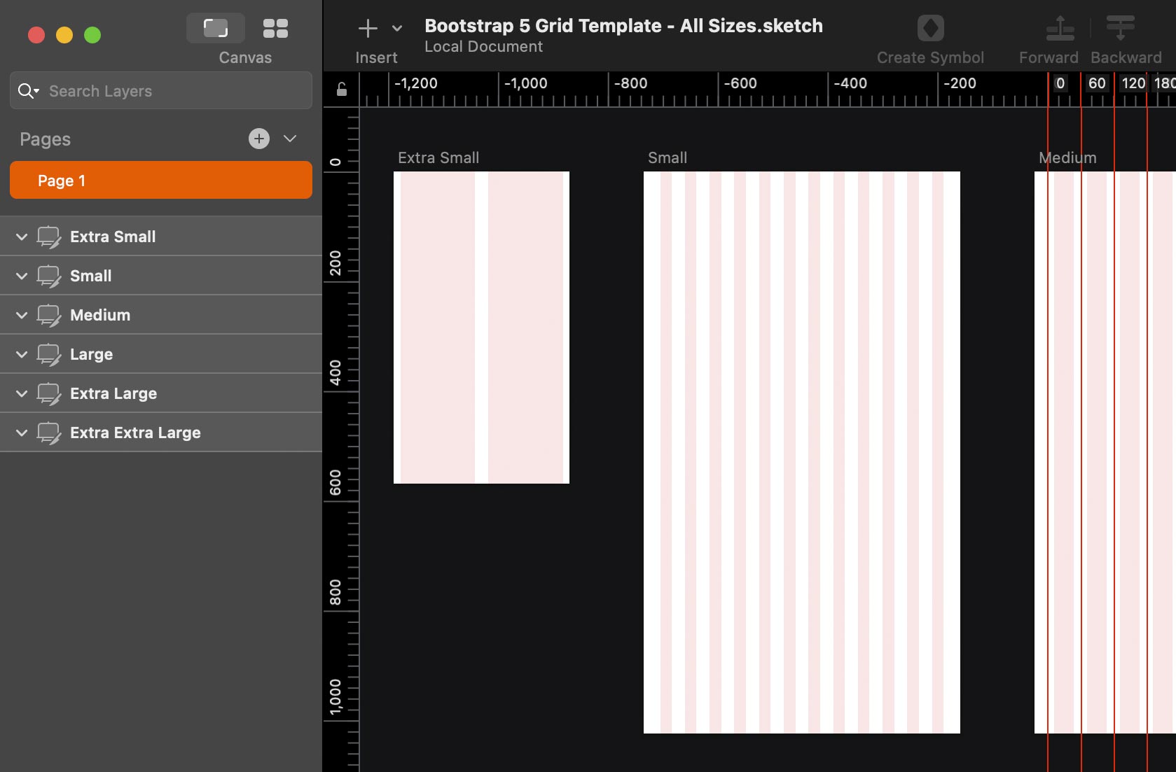
I found that most of the Bootstrap grids for Sketch did not use Sketch’s Show Layout (Ctrl–L) or don’t mark the midpoint of column gutters, so that’s why I made this grid template. I hope you like it!
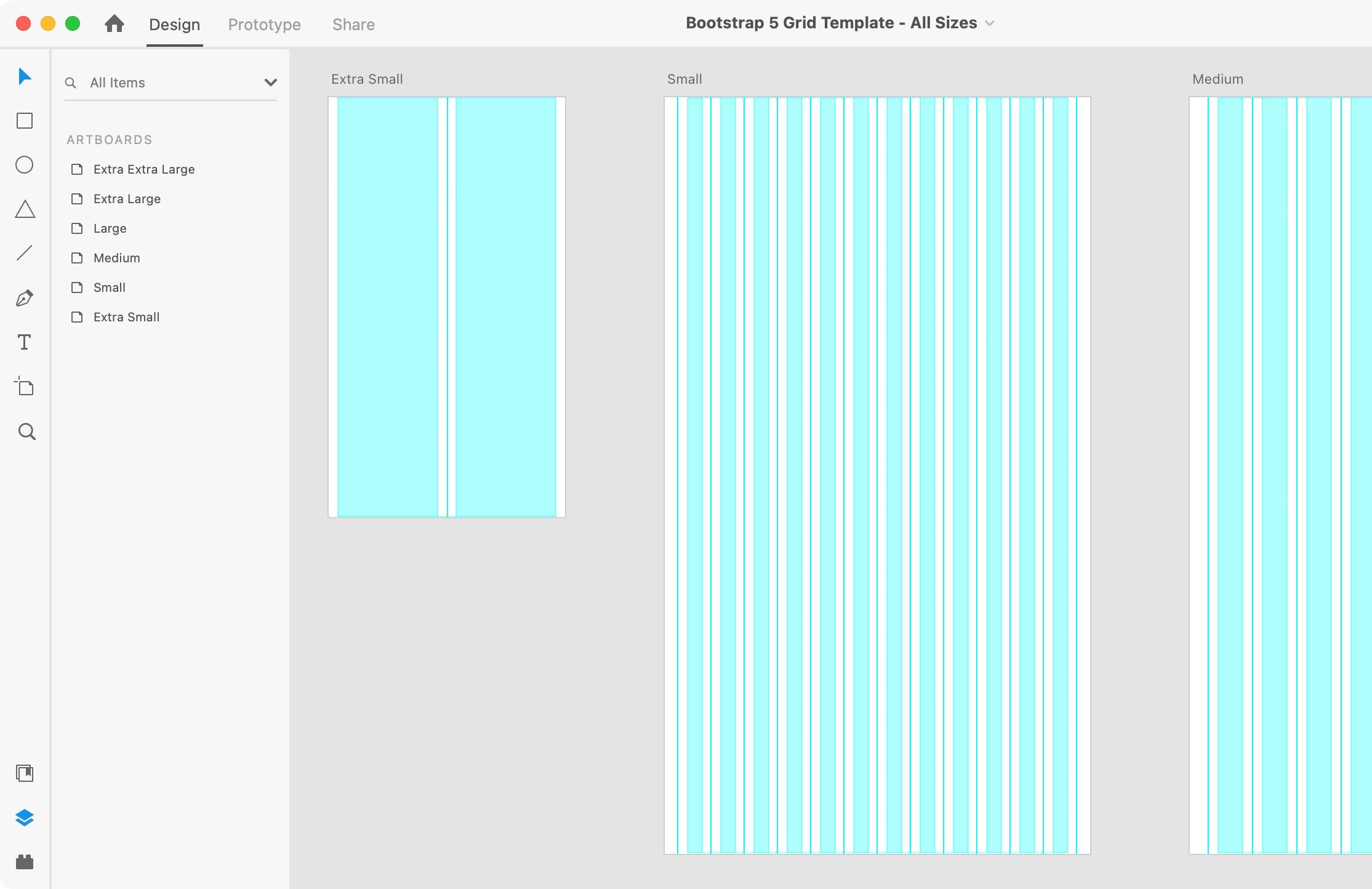
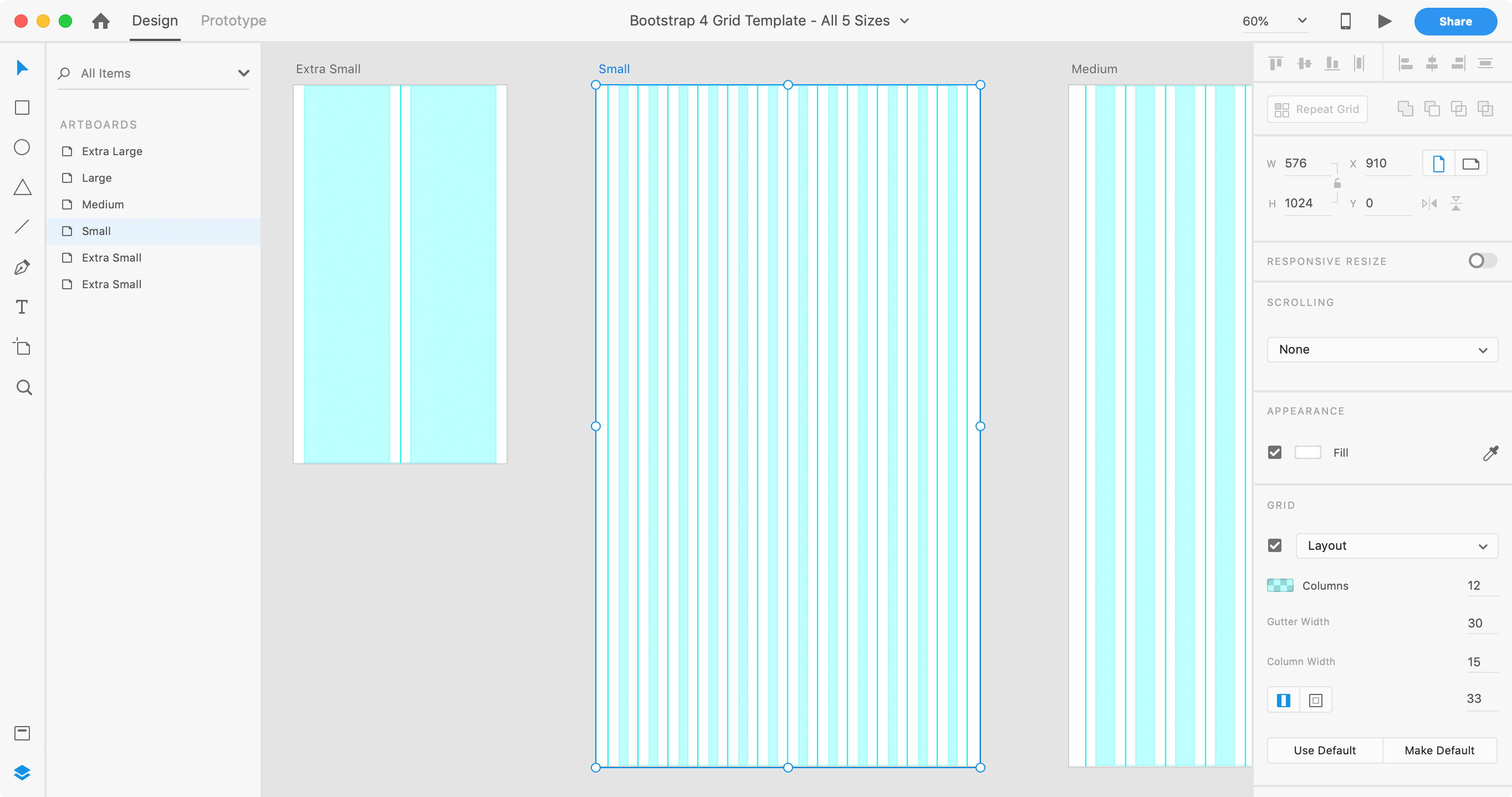
I couldn’t find a good clean Bootstrap grid for Adobe XD that uses XD’s layout grid feature with guides to mark the midpoint of column gutters. So I made this grid template and I hope you like it!
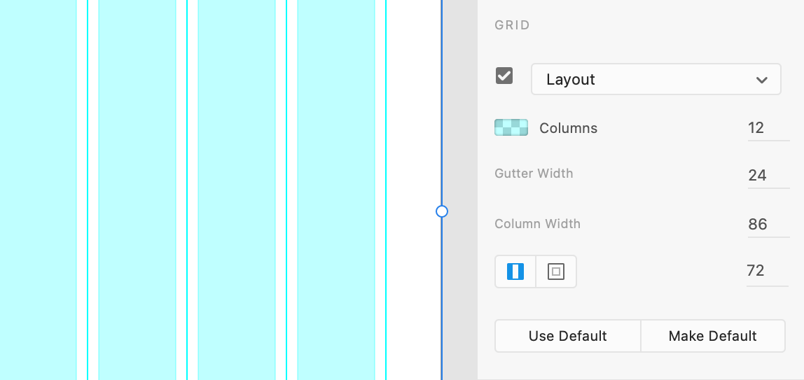
Calculating the layout grid settings in Adobe XD is harder than it should. Unlike Sketch (which makes it easy), XD does not let us specify a design area (called a container in grid systems like Bootstrap.
Adobe XD forces us to define margins (the area outside the container/design area). This makes it a huge pain when you simply want to increase or decrease your column gutters. So I came up with an easy way to calculate the grid settings.
Last month Lux (the makers of Halide, an iPhone/iPad camera app) published an interesting article “iPhone 13 Pro: The Edge of Intelligent Photography”
iPhone 13 Pro is a big shift in iPhone photography. Not only are the cameras all upgraded in significant ways, but Apple’s adaptive, clever computational smarts have never been so powerful. Touching every aspect of the photographic experience, you might be surprised to at times become aware of its power and limitations alike.
Until July 17, 2020 you can save up to 25% off the Creative Cloud in the US, Canada, and Mexico. You can save on:
Fellow Mac users, have you ever wanted to make a window fill the screen but didn’t want to use the default full-screen mode (where the menubar disappears)?
There are new (hidden) ways to enlarge your window without going full-screen (which I honestly don’t like). They work in macOS Sierra and later.
macOS Catalina (macOS 10.15) requires apps to be 64-bit. That means older 32-bit apps will no longer run.
Adobe’s Creative Suite was retired years ago and is not supported. If you want to continue using Adobe’s creative apps (InDesign, Illustrator, Photoshop, etc.) you must join the Creative Cloud or remain on an older version of macOS (Mojave or prior).
When creating numbered lists in InDesign, I like the numbers to align to the right (so they align on the period). Doing this is not as intuitive as it should be, so I wanted to share how it’s done.
I couldn’t find a good clean Bootstrap grid for Adobe XD that uses XD’s layout grid feature with guides to mark the midpoint of column gutters. So I made this grid template and I hope you like it!
I like the new dark mode in macOS Mojave, but sometimes I need to switch back to light mode. I wanted a faster way than having to go into System Preferences. While looking for an answer, I came across a simple AppleScript that I want to share with everyone. Don’t worry if you’ve never even used and AppleScript before, this is easy to use and you don’t have to understand anything about AppleScript!
After selecting a masked object, I wanted to select the mask via a keystroke. At first I couldn’t find the answer, but you can do it… and it’s easy!
Over a year ago I wrote Is Adobe XD Ready for Production Work? and a lot has changed since then. So it’s time for an update!
At Adobe MAX 2016, Adobe said “you really have everything you need to be successful doing production work inside of XD”.
I like designing with Sketch, and Adobe XD is clearly inspired by Sketch (to put it mildly). It’s been out of beta for a while now, so can you really do production work with it? That depends on your needs. To help you decide, I’ve compiled a list of its limitations.
Disclosure: If you make a purchase using my links to Adobe’s website, I may earn a commission (which helps support me).
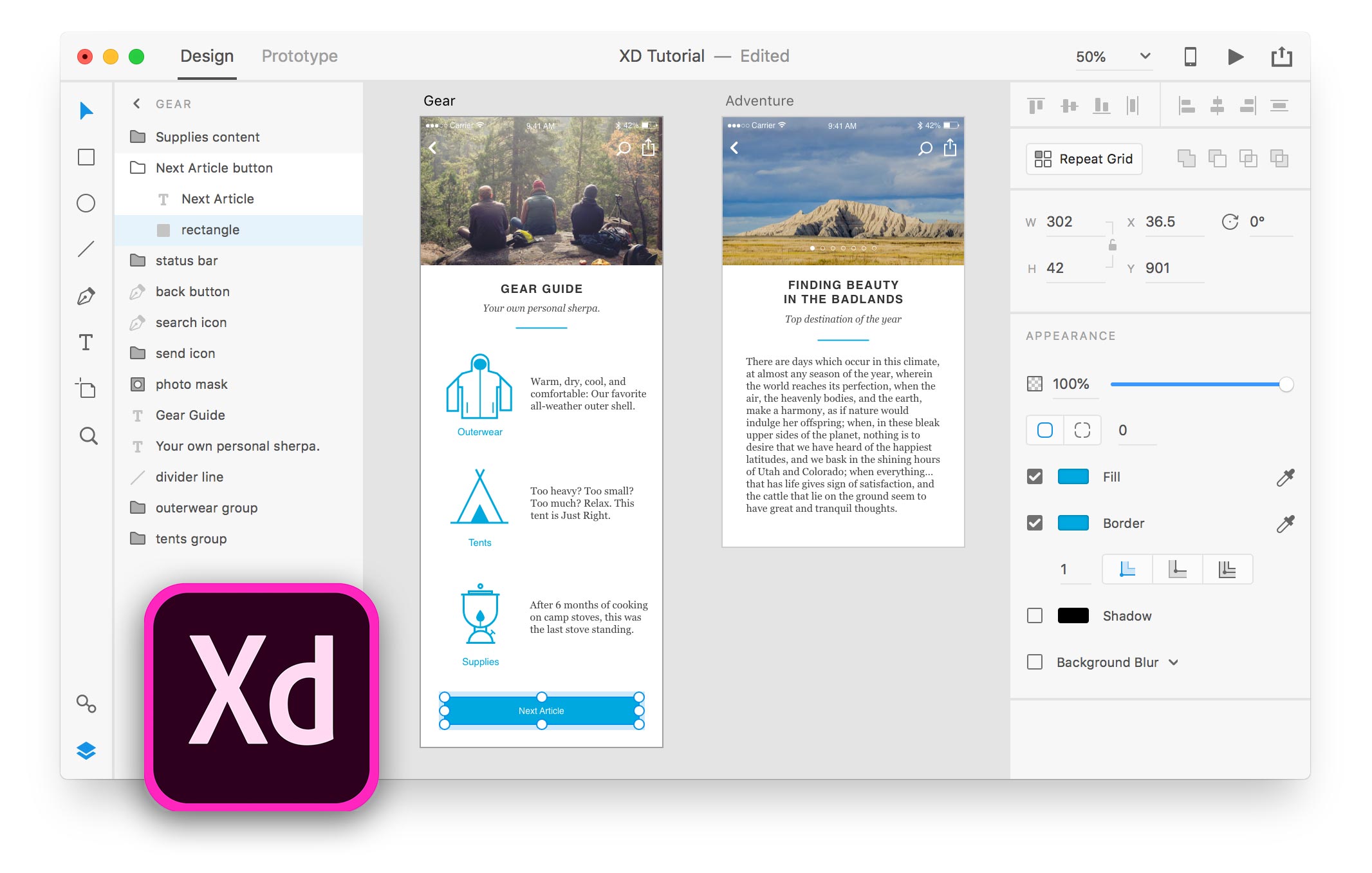
Prior to iOS 11, you could drag a local webpage (.html file) onto the iOS Simulator to view it in Safari. Now it tries (but fails) to add the file into the new Files app. Luckily I found a pretty easy workaround.
I found that most of the Bootstrap grids for Sketch did not use Sketch’s Show Layout (Ctrl–L) or don’t mark the midpoint of column gutters, so that’s why I made this grid template. I hope you like it!
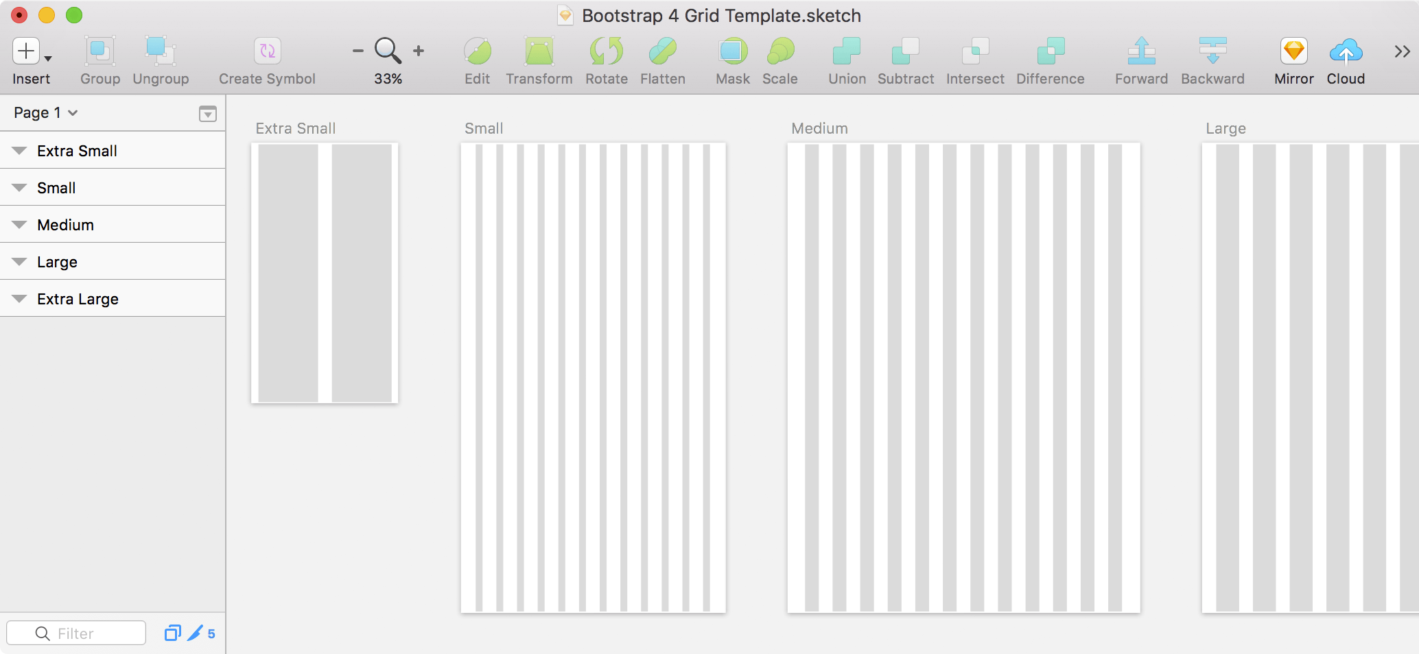
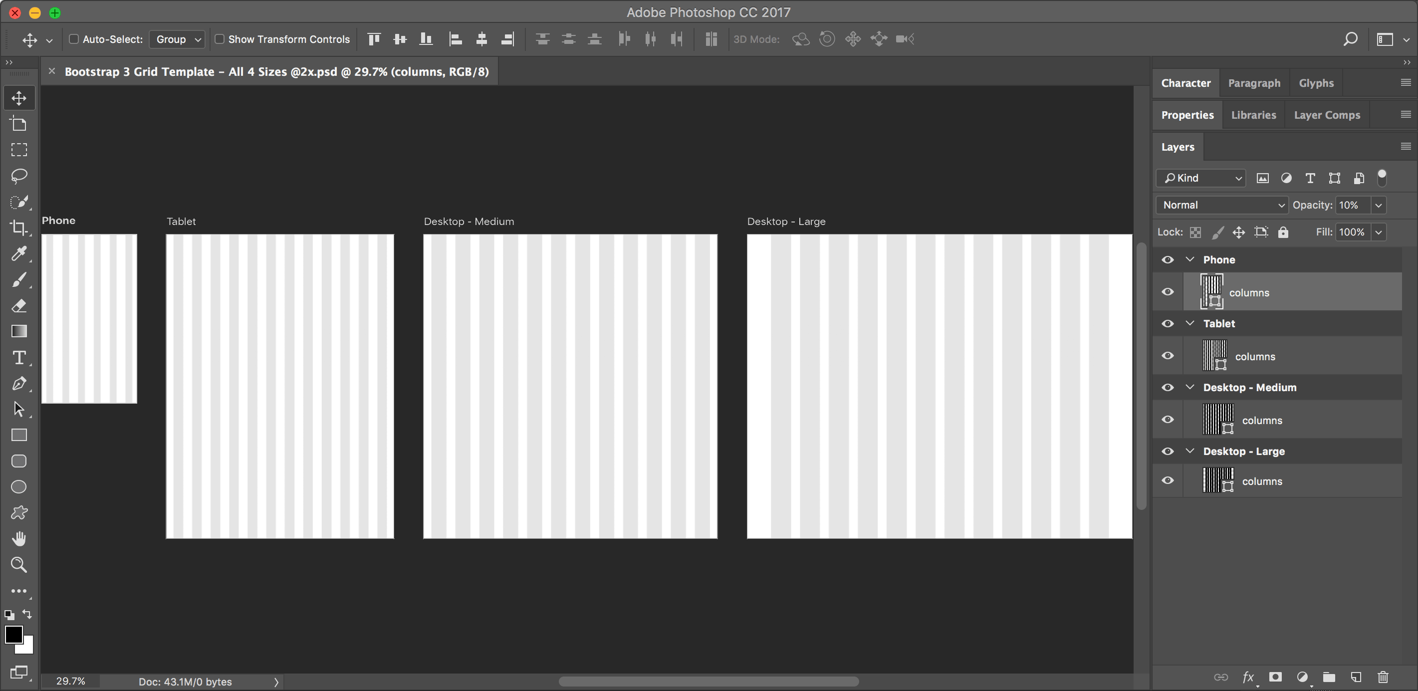
I could not find a Bootstrap grid for Photoshop that uses artboards, so I made one. I hope you like it! Artboards require Photoshop CC, so this won’t work in CS6 or older.
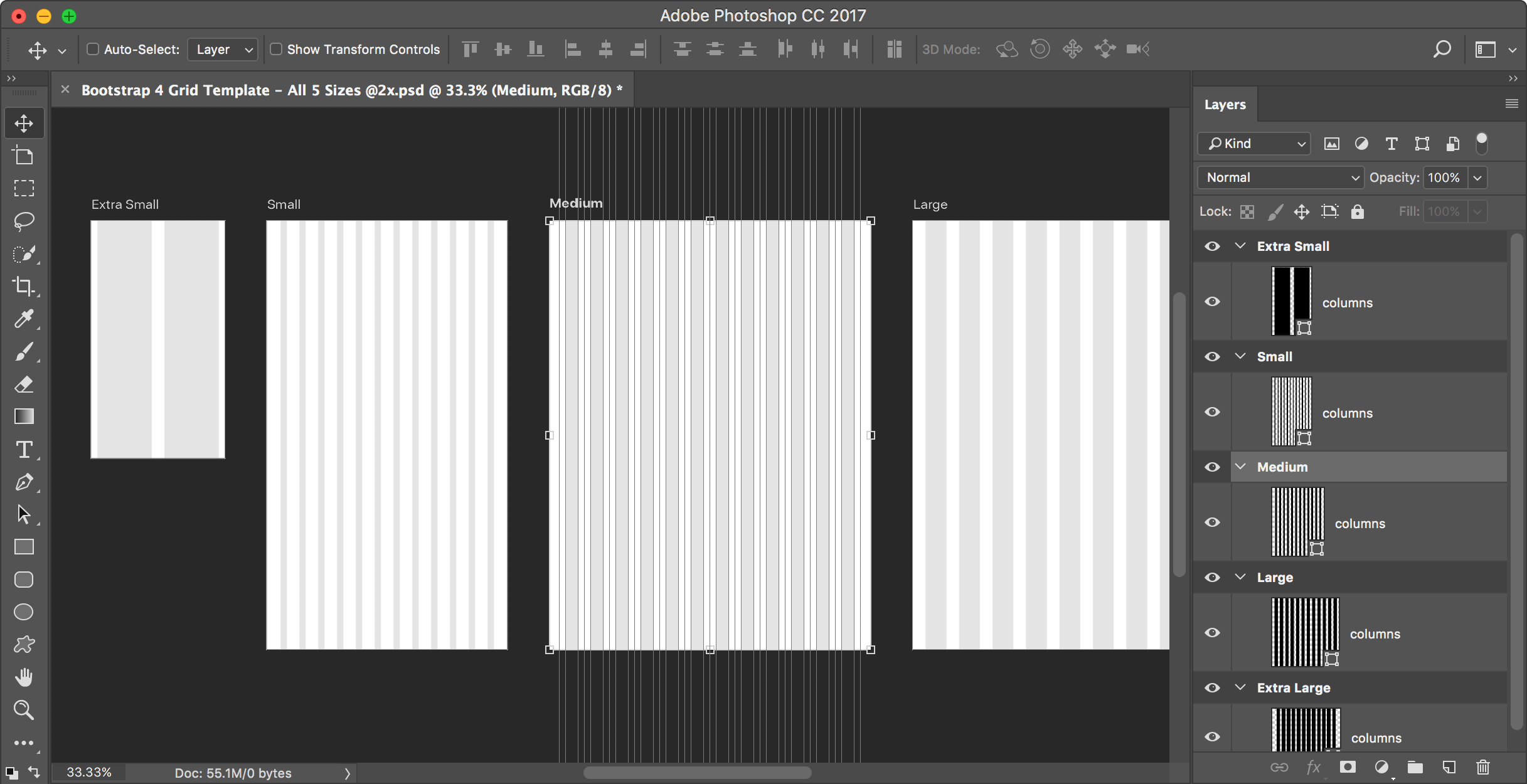
When saving SVG (scalable vector graphics) in Adobe Illustrator, there are some things you should know that will affect the quality of the SVG files you produce.
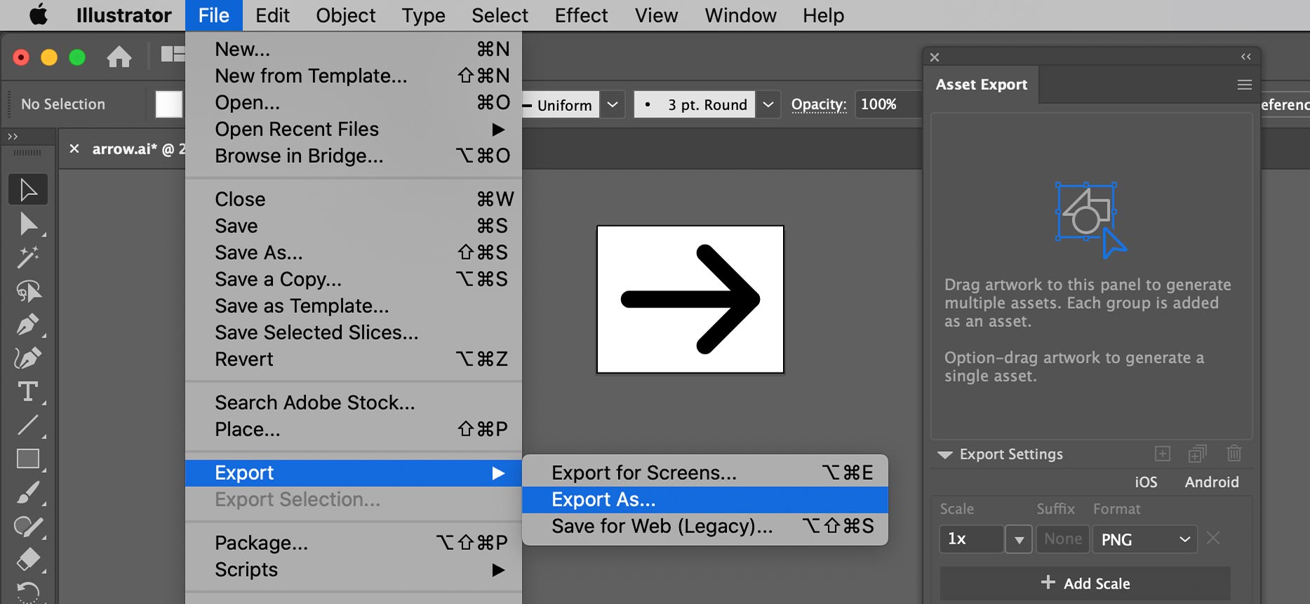
To show hidden files/folders in the Mac Finder or Open/Save dialogs you don’t have to use Terminal commands, all you need is one keystroke!
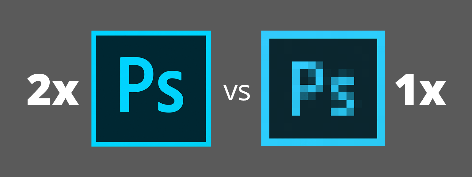
I’ve seen many web designers who work at 1x and I’ve read articles that say it’s best to design at 1x. But I think a more modern workflow is to work at 2x (Retina) size. In this article I’ll explore the various issues affecting our workflow, so you can understand why I recommend designing at 2x.
Let me clarify something before getting started. I’ll only talking about designing web graphics in Photoshop. Other apps like Sketch, Adobe XD, or Illustrator work totally differently, so this article will only focus on Photoshop.
If your unsure of what I mean by 1x and 2x, please read my post: Retina Web Graphics Explained.

I find that many designers (especially those coming from print) don’t really understand how resolution works on the web, so I’d like to explain it. These concepts apply to whatever design app you use (Photoshop, Sketch, Adobe XD, Illustrator, etc.) and understanding this will help you create properly sized web graphics.
If an image will be coded into a space of 300 pixels, you have to make:
In a webpage, both images will be coded so they appear physically the same size, but the 2x image has more pixels squeezed into that space (so it appears sharper and more detailed).
NOTE: The resolution you see in Photoshop (such as 72ppi) is ignored by web browsers and is therefore irrelavent. It does not matter what the resolution is set to (so just make it 72ppi). All that matters is the pixel width and height of your images!
Adobe’s Creative Suite has been officially retired. If you want to purchase Adobe’s creative apps (Photoshop, Illustrator, InDesign, etc.) you must join the Creative Cloud. With no fanfare, Adobe updated their CS6 page to say “As of January 9, 2017 Creative Suite is no longer available for purchase.”
At Adobe MAX 2016, Adobe said “you really have everything you need to be successful doing production work inside of XD”.
I like designing with Sketch, and Adobe Experience Design (XD) is clearly inspired by Sketch (to put it mildly). I’ve started learning XD and it does show a lot of potential. It’s still in beta, so can you really do production work with it? That depends on your needs. To help you decide, I’ve compiled a list of its limitations.
Disclosure: If you make a purchase using my links to Adobe’s website, I may earn a commission (which helps support me).
Did you know Google has a color picker you can use to mix up new colors, or convert color values between HEX, RGB, HSL, and more? Here’s how to use it!
At the bottom of Photoshop’s Export As dialog (found in File > Export) there is an icon to the left of the zoom ![]() that has no tooltip when you mouse over it. Depending on the image you might not see any effect if you click it. It’s a pretty cryptic icon, so what does it do?
that has no tooltip when you mouse over it. Depending on the image you might not see any effect if you click it. It’s a pretty cryptic icon, so what does it do?
In CC 2017, Adobe completely redesigned Photoshop’s File > New dialog, but it’s slow to open and not as nice to use. The useless thumbnails are large, while the written specs (which are the most important thing) are smaller and harder to scan.
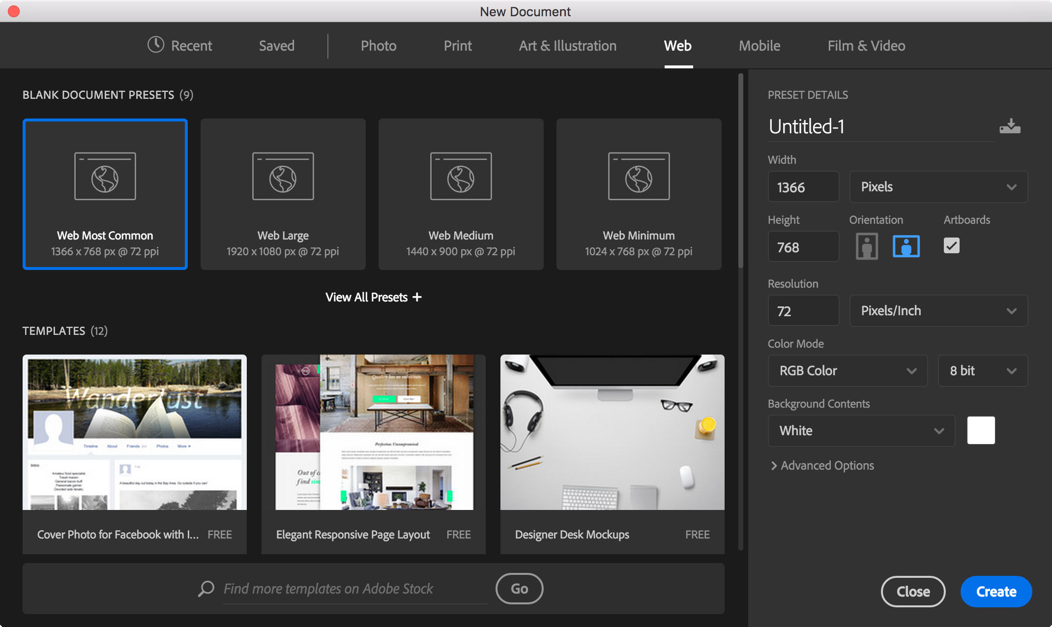
Luckily there’s a way to get the previous dialog back! (This also works in Adobe Illustrator.)
I could not find a Bootstrap grid for Photoshop that uses artboards, so I made one. I hope you like it! Artboards require Photoshop CC, so this won’t work in CS6 or older.
macOS Sierra brings picture-in-picture videos. In Safari, Right–click (or Control–click) the video and choose Enter Picture-in-Picture. The video will change to a small floating window that you can position in any corner of the screen.
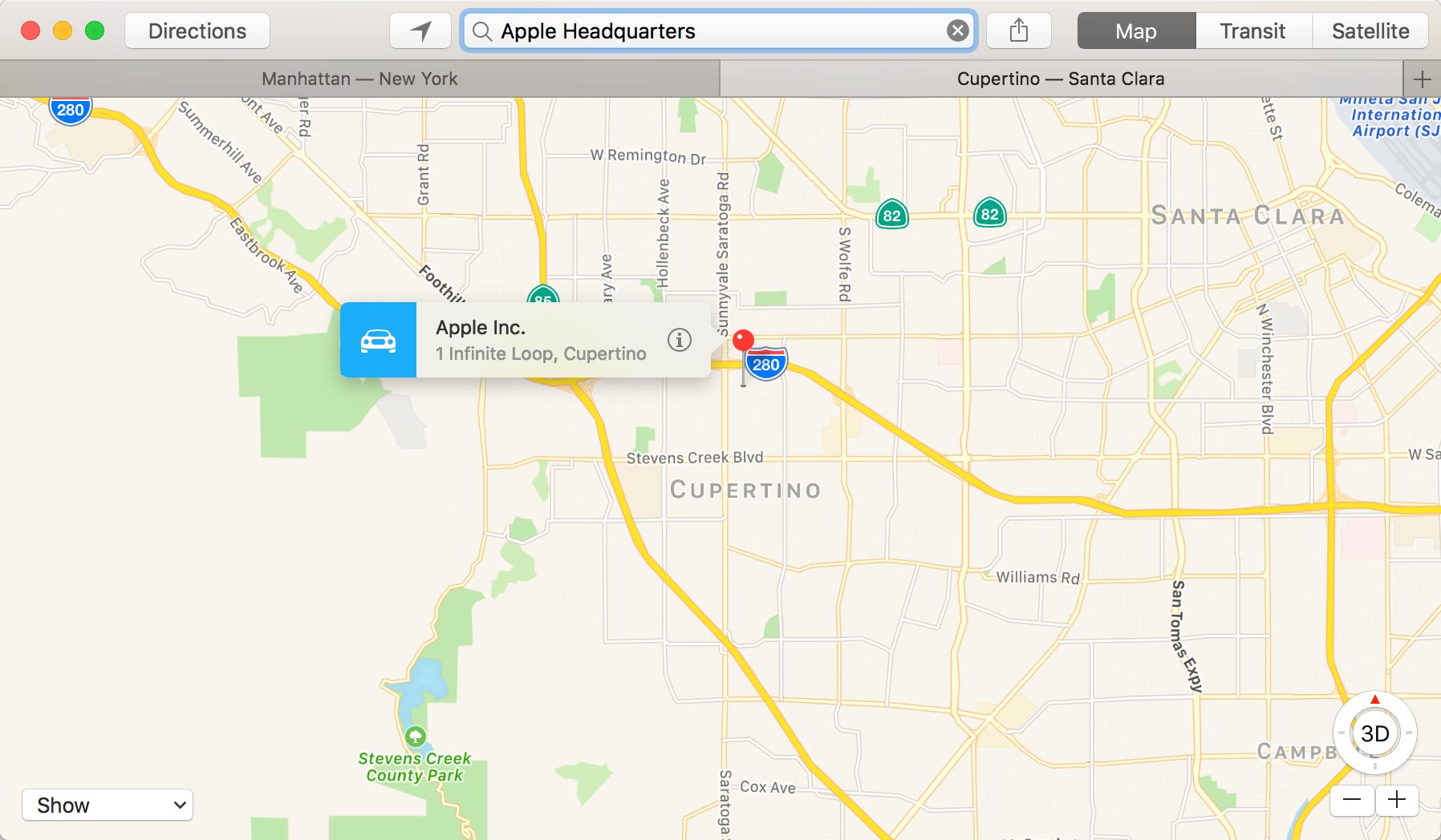
macOS Sierra brings system-wide access to tabs for many Apple apps as well as third party apps. Apps may need to be updated to take advantage of them, but Apple has updated many of its own apps (such as Maps, Keynote, Numbers, etc.) to support tabs.

While Apple’s full-size keyboards have dedicated Home, End, Page Up, & Page Down keys, their compact keyboards (such as those found on laptops) do not. Instead, they double-up the function of some keys. Apple does not label the second function of all the keys, so not everyone realizes their full potential!
Last month Smashing Magazine published an interesting article asking “Is The Internet Killing Creativity?” Here are some of my thoughts on the subject.