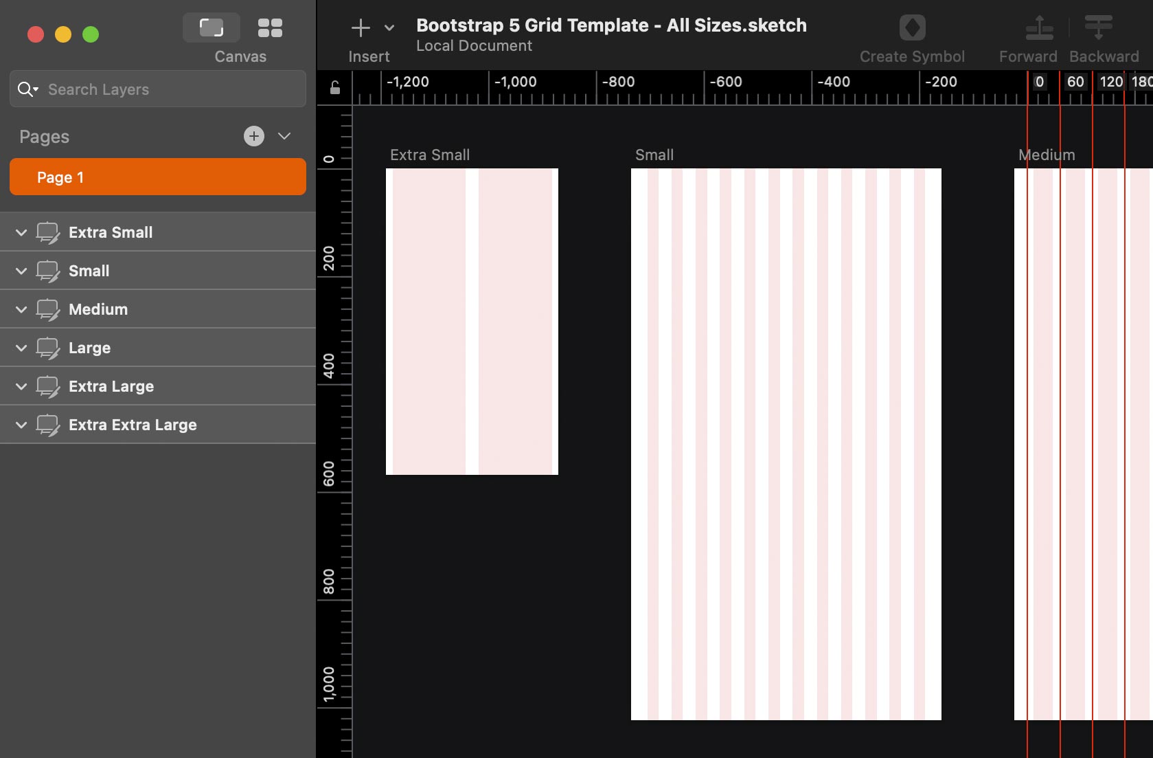
I found that most of the Bootstrap grids for Sketch did not use Sketch’s Show Layout (Ctrl–L) or don’t mark the midpoint of column gutters, so that’s why I made this grid template. I hope you like it!

What’s Included
The template contains artboards for the various device sizes in Bootstrap 5:
- Extra Small Devices <576px (I used an iPhone SE size)
- Small Devices ≥576px
- Medium Devices ≥768px
- Large Devices ≥992px
- Extra Large Devices ≥1200px
- Extra Extra Large Devices ≥1400px
The midpoints between columns (the middle of the gutter) are marked with guides.
Video Demo
Even though this video is for the older Bootstrap 4 template, it still is applicable to Bootstrap 5.
Subscribe to my YouTube Channel
Tips for Using the File
- To hide or show the column shading, hit Ctrl–L for Show Layout.
- To hide or show the column and gutter guides, hit Ctrl–R for Show Rulers.
How to Customize the Gutter Width
Bootstrap 5 defaults to a 1.5rem (24px) gutter, but that can be changed. To customize that:
- In Sketch, choose View > Canvas > Layout Settings.
- Set Gutter Width to your desired amount.
Download: Name Your Own Price
Pay what you want (choose $0 to download it for free). It’s up to you, but it’s nice to be supported for my work.
For commercial or personal use. Please tell others about this template, but send them to this webpage to get it. (Do not redistribute this template on any other website.)