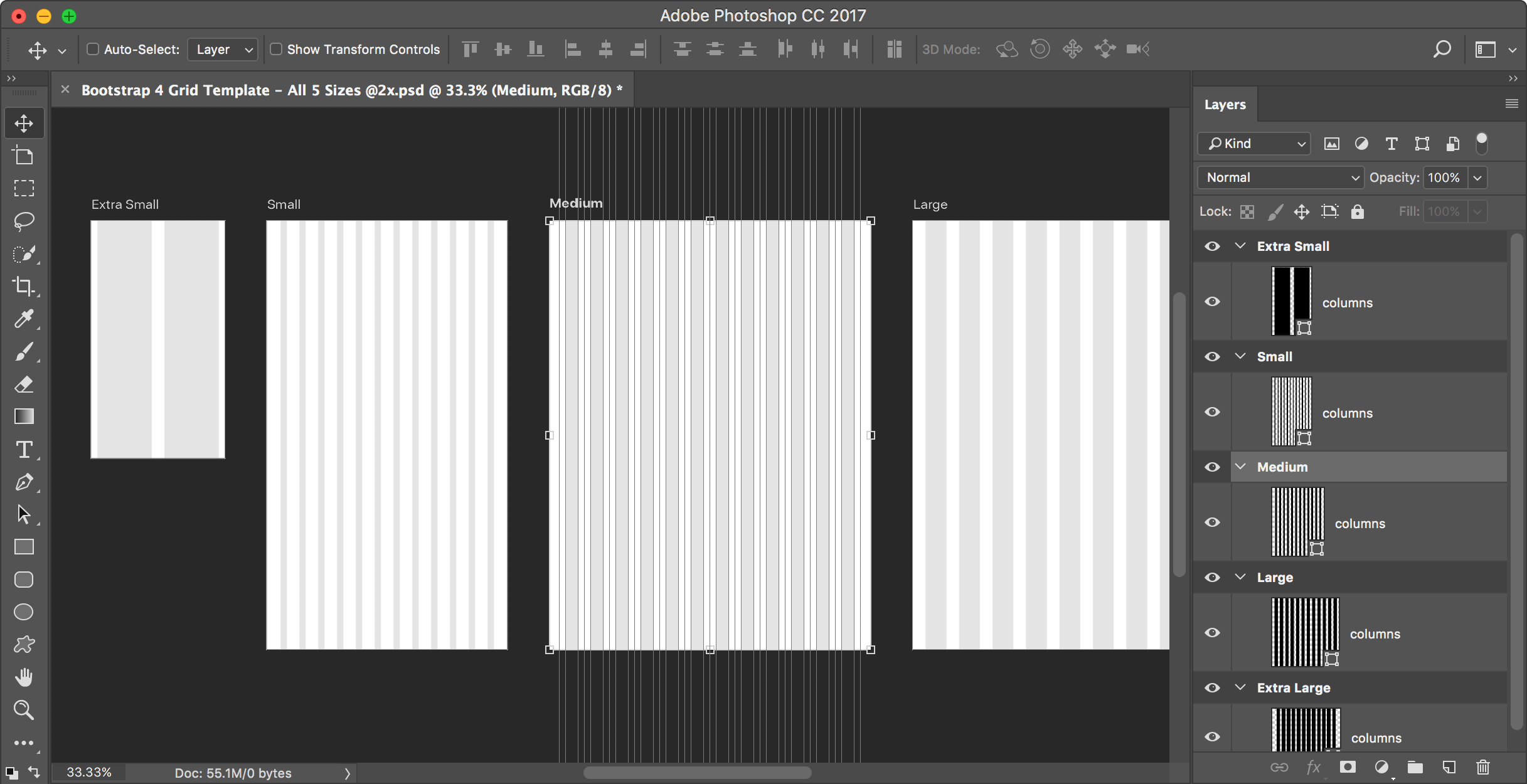
I could not find a Bootstrap grid for Photoshop that uses artboards, so I made one. I hope you like it! Artboards require Photoshop CC, so this won’t work in CS6 or older.

Free for commercial or personal use. Please tell others about this template, but send them to this webpage to get it. (Do not redistribute this template on any other website.)
What’s Included
The template contains artboards for the various device sizes in Bootstrap 4:
- Phone: Extra Small Devices <768px. I used an iPhone SE (or iPhone 5) size.
- Tablet: Small Devices ≥768px
- Desktop - Medium: Medium Devices ≥992px
- Desktop - Large: Large Devices ≥1200px
Includes 1x & 2x (Retina) Versions
I’ve included 1x and 2x versions of the template so you’re free to choose whichever you want. While many designers work at 1x, I think a more modern workflow is to work at 2x (Retina) size. Working at either size has drawbacks, but I recommend 2x. To learn why, read my article Designing Retina Web Graphics in Photoshop: Should You Work at 1x or 2x?
Tips for Using the File
- You can change the column shading color by double-clicking on the columns layer thumbnail.
- To hide or show the column and gutter guides, hit Cmd–; (Mac) or Ctrl–; (Windows) or choose View > Show > Guides.