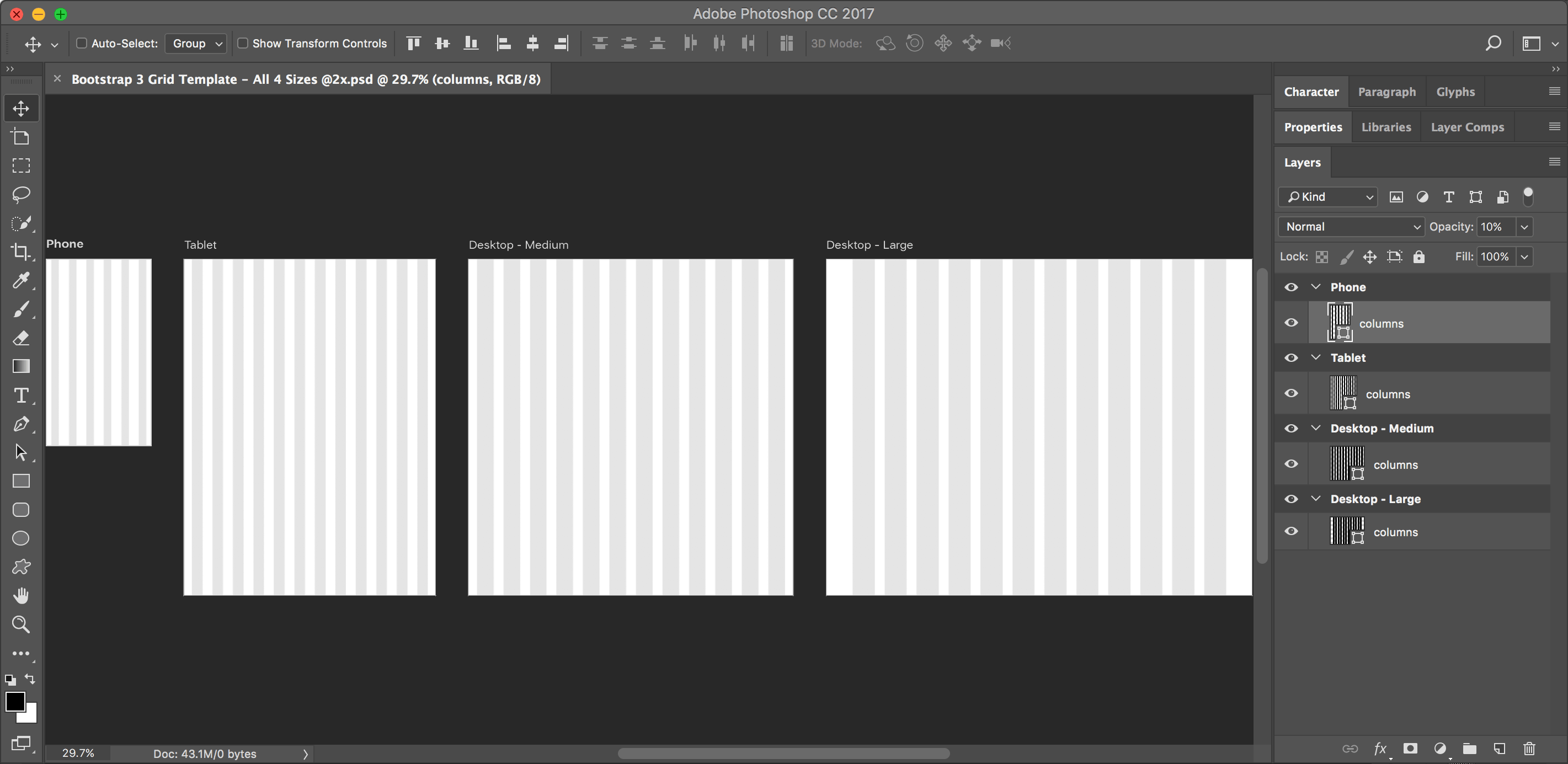
I could not find a Bootstrap grid for Photoshop that uses artboards, so I made one. I hope you like it! Artboards require Photoshop CC, so this won’t work in CS6 or older.

Please keep in mind that Bootstrap’s column widths are defined as percentages. Rounding to whole pixels can lead to uneven columns, so the grid is occasionally off by a pixel. It should be close enough though for mocking up your designs.
Free for commercial or personal use. Please tell others about this template, but send them to this webpage to get it. (Do not redistribute this template on any other website.)
What’s Included
The template contains artboards for the various Bootstrap device sizes:
- Phone: Extra Small Devices <768px. I used an iPhone SE (or iPhone 5) size.
- Tablet: Small Devices ≥768px
- Desktop - Medium: Medium Devices ≥992px
- Desktop - Large: Large Devices ≥1200px
Includes 1x & 2x (Retina) Versions
I’ve included 1x and 2x versions of the template so you’re free to choose whichever you want. While many designers work at 1x, I think a more modern workflow is to work at 2x (Retina) size. Working at either size has drawbacks, but I recommend 2x for the following reasons:
When using Adobe Generator to export 2x assets from a 1x design, Photoshop has a bug if the placed Smart Object was originally a JPEG. The exported asset will be low quality and blurry. Working at 2x avoids this (and from a 2x design Photoshop can create the smaller 1x versions just fine if you need them).
Your designs look great while designing on a 2x Retina display. If you don’t have one yet, you will eventually.
When using the Adobe Preview CC mobile app to preview your phone and tablet designs on an iPhone or iPad (live while you work), you’ll want 2x files to see the full quality.
NOTE: One downside of working at 2x is that everything needs to be doubled. Your type sizes are twice the normal size. A 1px stroke would need to be 2px. So make all values even (2, 4, 6, 8, etc.) and you’ll be fine.
Tips for Using the File
- You can change the column shading color by double-clicking on the columns layer thumbnail.
- To hide or show the column and gutter guides, hit Cmd–; (Mac) or Ctrl–; (Windows) or choose View > Show > Guides.