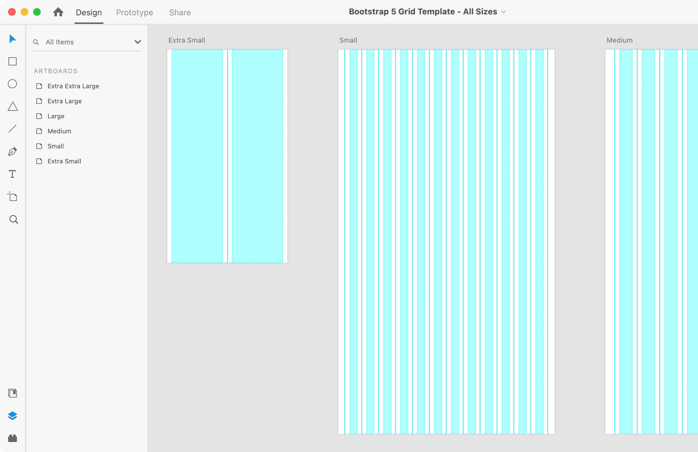
I couldn’t find a good clean Bootstrap grid for Adobe XD that uses XD’s layout grid feature with guides to mark the midpoint of column gutters. So I made this grid template and I hope you like it!

What’s Included
The template contains artboards for the various device sizes in Bootstrap 5:
- Extra Small Devices <576px (I used an iPhone SE size)
- Small Devices ≥576px
- Medium Devices ≥768px
- Large Devices ≥992px
- Extra Large Devices ≥1200px
- Extra Extra Large Devices ≥1400px
The midpoints between columns (the middle of the gutter) are marked with guides.
I’ve also included a spreadsheet for easily and quickly calculating the grid settings. This is useful if you want to customize the gutter width (see below for more details), or to create any custom grid settings (not only Bootstrap).
Tips for Using the File
- To show or hide the column shading, hit Cmd–Shift–
'(Mac) or Ctrl–Shift–'(Windows) for View > Show/Hide Layout Grid. - To show or hide the gutter divider guides, hit Cmd–; (Mac) or Ctrl–; (Windows) for View > Guides > Show/Hide All Guides.
How to Customize the Gutter Width
Bootstrap 5 defaults to a 1.5rem (24px) gutter, but that can be changed. To customize that:
- Open the file Calculate Adobe XD Grid Settings.xlsx which is included in the download. If you do not have Excel, you can open it in Google Sheets or Apple’s Numbers app.
- Enter the desired gutter width, and it will automatically calculate the grid settings you’ll need for XD.
- In Adobe XD, select an artboard.
- In the Property Inspector panel on the right, under Grid enter the new settings (you may have to check the box next to Layout to see the grid settings).
Download: Name Your Own Price
Pay what you want (choose $0 to download it for free). It’s up to you, but it’s nice to be supported for my work.
For commercial or personal use. Please tell others about this template, but send them to this webpage to get it. (Do not redistribute this template on any other website.)